Chat widget components
The platform allows you to add components to the chat widget so that the user experience is not limited to plain text. There are two types of components - Interactive and Non-Intercative. Click here to know more about the limitations of the components.
Let's take an example, where you want to register for an online class through a website. With the help of date and time picker components in the chatbot, you can register quickly by providing the appropriate date and time instead of manually typing the text messages.
Each of these components supports both light and drak back ground theme.

1. Interactive messages
This type of message allows you to make a quicker selection from a menu when interacting with a bot. It allows the user to actively interact with the chatbot by clicking buttons, menus, or custom actions.
Following are the types of interactive message components:
1.1 Quick replies
| This component allows you to reply to the bot with the pre-defined buttons. When your user clicks on any of the quick reply buttons, a message is sent into the conversation. Click here to implement Quick replies using a node. |  |
1.2 Multi select
| This is similar to quick replies. It consists of multiple quick reply buttons where the user can select multiple options at once to send the response to the chatbot. Click here to implement Multi-select using a node. • Limitation: You can configure upto 100 options. |  |
1.3 Date picker
| Allows you to select a preferred date from the calendar view. The date is displayed in the predefined format. If the user's input contains a date or a time, it will pass the validator. Otherwise, the specified validation fail message will be sent. Click here to implement Date picker using a node. |  |
The following are the different date pickers supported:
| options | Description |
|---|---|
| Single date picker | Allows a user to select a single date from a calendar. |
| Range date picker | Allows a user to select a start and end date from a calendar.  |
| Month date picker | Allows a user to select a month from the date picker.  |
| Simple date and time picker | Allows a user to select a date and time, which is in the pre-defined format.  |
| Time picker | Allows a user to add time to the conversation.  |
1.4 Cards
This component uses UI annotations to display concise information related to a specific context in a limited-space container using images, buttons, and links to download attachments. Click here to implement cards using a code-based approach.
The following are some key features of cards:
- Provide a richer experience in chatbot conversations when compared to text based messages.
- Display information in the widget so your users get direct insights into their queries without switching screens.
Following are the different types of interactive cards:
| Cards | Description |
|---|---|
| List card (Generic card) | Displays lists of records that are related to the specific queries. |
| Product card | Provides all the detailed information about your product, such as the product name, image, variants, and description. |
| Slider card | Allows you to choose the minimum and maximum value within the defined range by sliding the pointer. |
| Multi select transaction card | Allows you to view multiple transaction details at a time. Each of the transactions contains details such as title, amount, account number, time, and status. With this card, you can perform the following actions: • Select: Enable the checkbox to select one or more transactions from the list. • Load more: Displays up to 5 transactions at a time. To view the next set of transactions from the current list, click on Load more button. • Submit: You can submit the selected transactions to the bot by clicking the Submit button. Note that, Submit and Load more buttons are disabled once the transactions are submitted. Limitations: • A maximum of 50 characters is supported for the title. • This card is compatible with all widget modes, including PWA, SDK, and Web widget. • It supports an icon or a fallback avatar for each transaction. • You cannot customize the card title, and there is no restriction on the number of options you can add. ) |
| Single select transaction card | You can use this card when you want your users to select a single transaction from the list. For example, to see transaction details. When you enable Single select transaction card, bot users can select one transaction from the list and click on Submit. By default, it shows up to five transactions. To view the next set of transactions, users can use Load more. Note that, Submit and Load more buttons will be disabled once the user clicks on Submit. Limitations: • A maximum of 50 characters is supported for title. 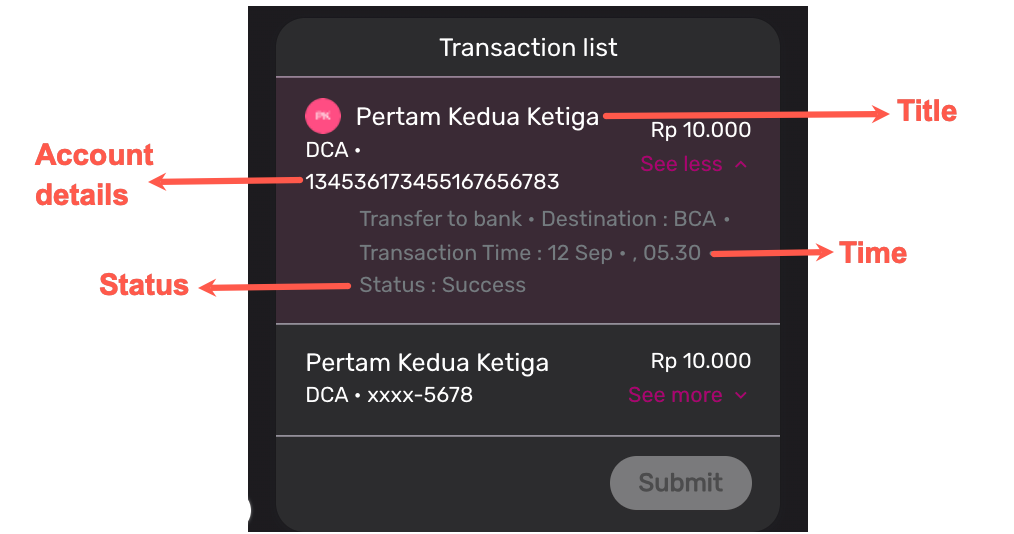 |
1.5 Media
This component allows you to add images, videos, and files to the bot conversation.
| Video | Image | File |
|---|---|---|
 |  |  |
You can download video, image, and file sent by the bot or agent.
1.6 Feedback
| This feature allows you to collect user feedback. Feedback is collected based on the user's interaction with the chatbot or live agent at the end of the conversation. The feedback component has two options (:thumbsup: or :thumbsdown:) and star rating. Additionally, there is an optional text field to capture detailed feedback through text input. Users have the flexibility to skip any step of the feedback process. You can collect feedback through the following options: 1. (:thumbsup: or :thumbsdown:) The thumbs up or down options enable users to provide positive or negative feedback. Additionally, they can include comments based on their feedback selection. • Use this option to capture whether the user has liked or disliked the overall conversation. • You can configure the positive and negative feedback options according to your business needs. 2. Star rating This option allows users to rate their experience on a scale of 1 to 5. Depending on the rating, the following actions will be displayed: • Ratings 1 to 3 redirect users to a page with up to 5 predefined negative feedback options. • Ratings 4 to 5 redirect users to a page with up to 5 predefined positive feedback options. Click here to implement Feedback using a node. |   |
1.7 Location
| This component enables your bot users to search, select, or share location access using Google Maps. With this component, you can perform the following actions: • Share location: This enables you to share your current location. • Map: Expand the map view to pinpoint and select the desired location. Note that this function is not available on iOS devices. • Search for location: Search for a specific location you wish to share. The component will start displaying suggestions as users type. • Confirm: You can confirm the selected location by clicking the Confirm button. • Cancel: To close the map view, click the Cancel button. • Go back: Click this button to go back to the Share location option. Click here to implement Location using a node. |

1.8 Attachment
| This component allows you to upload documents, images, and other files from their device or from a cloud storage provider. |  |
1.9 Home button
| This component allows you to refresh a chatbot or to trigger a conversational flow. |  |
1.10 Upload file
| This component allows you to upload files in supported formats such as jpeg, jpg, png, gif, pdf, txt, doc, ppt, docx, pptx, xlsx, mp4, mp3, and mov. You can either attach a file or skip it. Click here to implement Location using a node. |  |
1.11 Callout banner
| A callout banner allows you to add a banner to the chatbot's conversation. It can be used to alert users about new products, services, special offers, and promotions. When multiple banners are configured for a chatbot, the banners are automatically scrolled every five seconds. You can also add the images to the callout banner. For more information on how to add the images to the callout banner, click here. Note that, the banner with an image cannot have buttons in it. Brands can select the close, or minimise button for banners. Upon minimising, users can later access the banner by clicking on the expand button. The user’s last selection is retained on page reload. You can trigger a flow or redirect users to a page or URL in the banner. Also, you can add a title to the banner when it is minimised (this is optional). Limitations: • You can add up to 4 banners with text or image. • Each callout banner supports two buttons with up to 24 characters each. • The callout banner supports 200 characters in the title. • You can add up to 2 buttons to the text banner. • Supported image size is 10MB. In the case of images, the width may vary, but the height remains fixed at 113 pixels. Note: You cannot add videos or GIFs to the callout banner. | 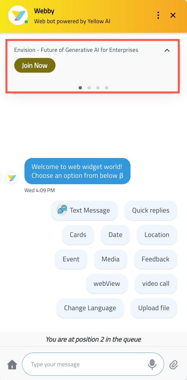 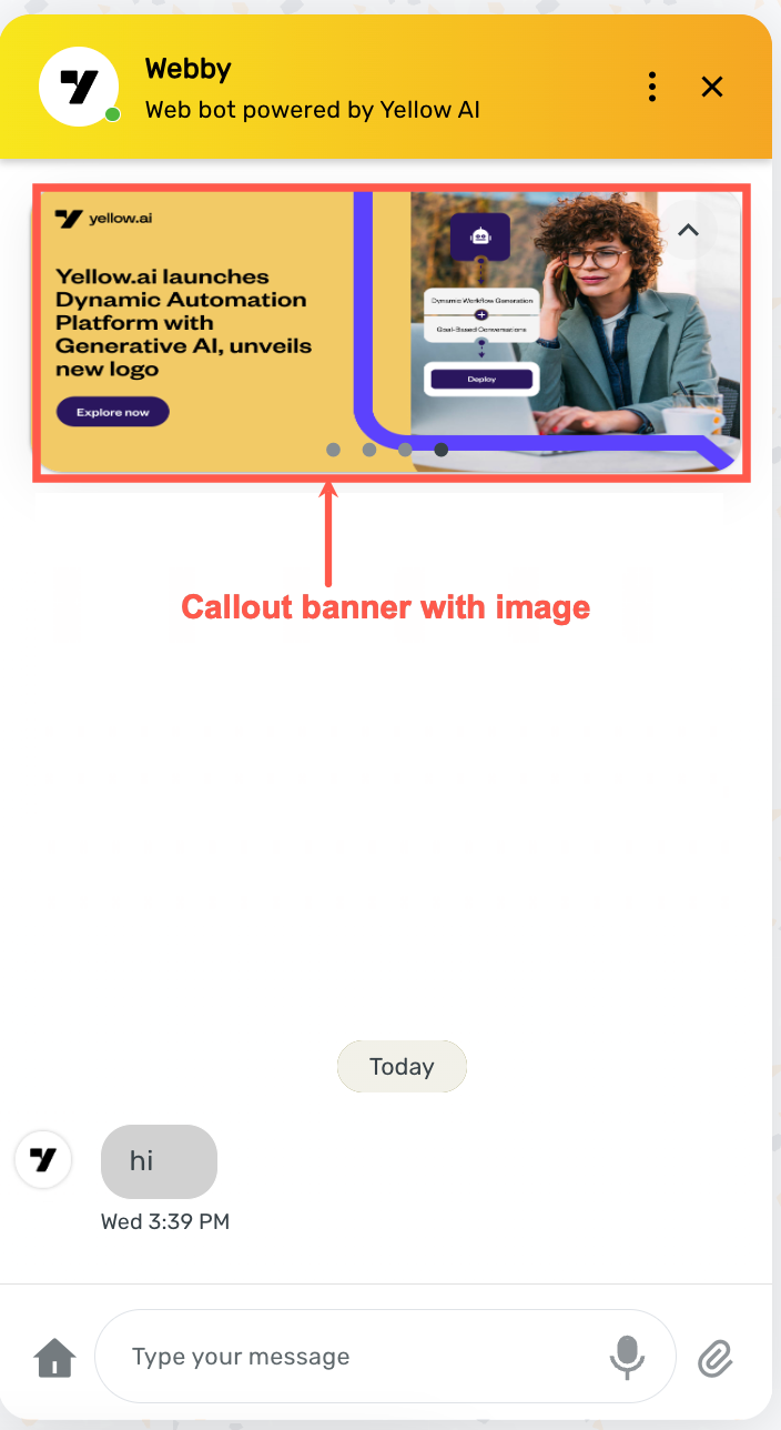 |
2. Non-interactive messages
This type of message does not require a response from your bot user by clicking the buttons, menus, or custom actions. A Chabot uses this type of message to generate automated response with all the details related to your queries.
Following are the types of non-interactive message components:
| Components | Description |
|---|---|
| Contact card | This component displays the information of the user and allows you to communicate with the user through email, phone, or WhatsApp.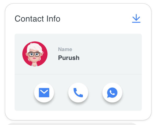 |
| Order status | This component is used to track the status of your order with details such as order Id, delivery date, and total amount.  |
| Transaction status | This component is used to track the status of your transactions.  |
| Receipt card | This component is used to display transaction or purchase-related details such as fixed deposit amount, interest rate, title, and reference ID. With this card, you can perform the following action: • Submit: Sends title header text and title header value data to the bot.  |